View


Somnob
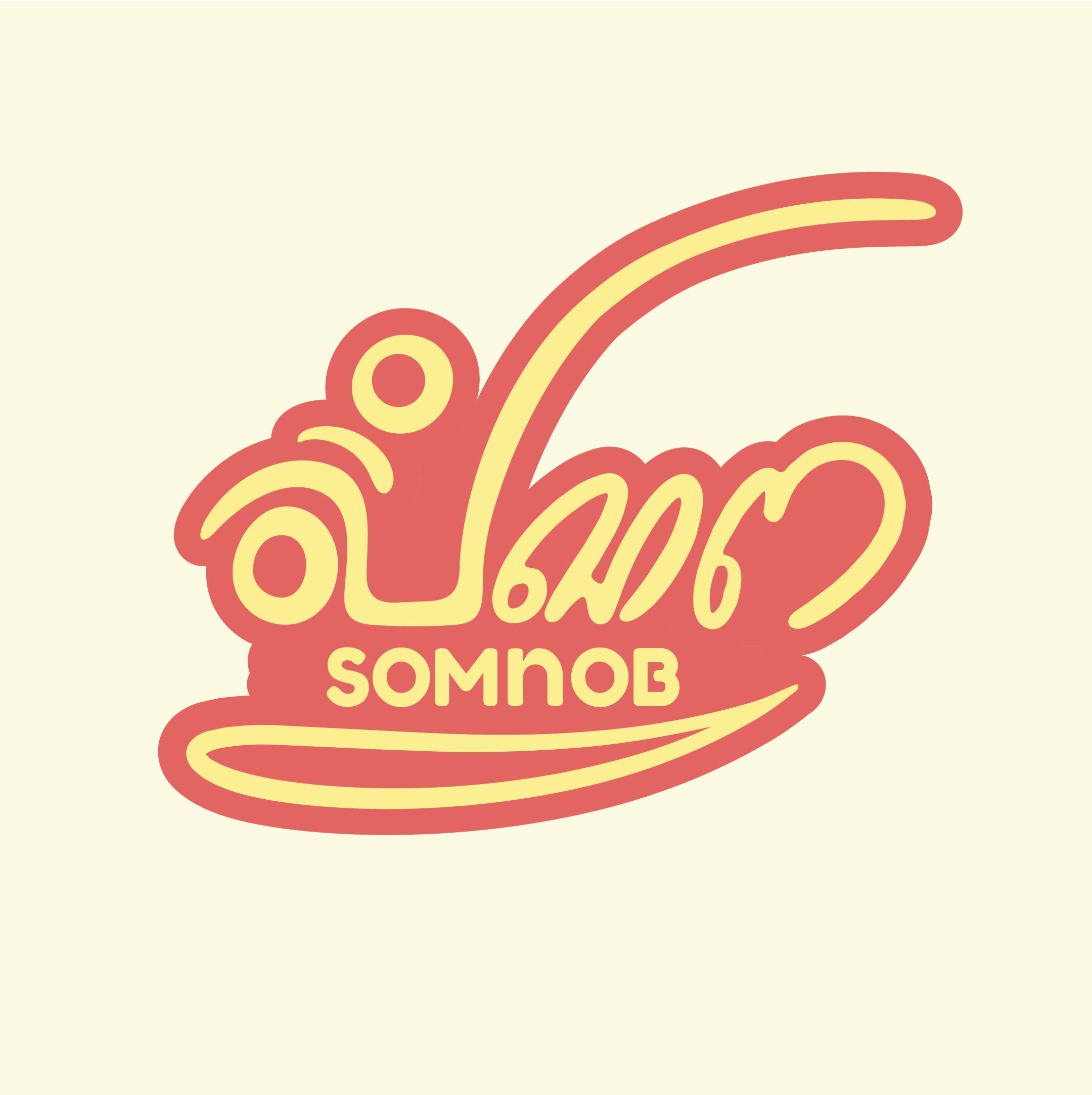
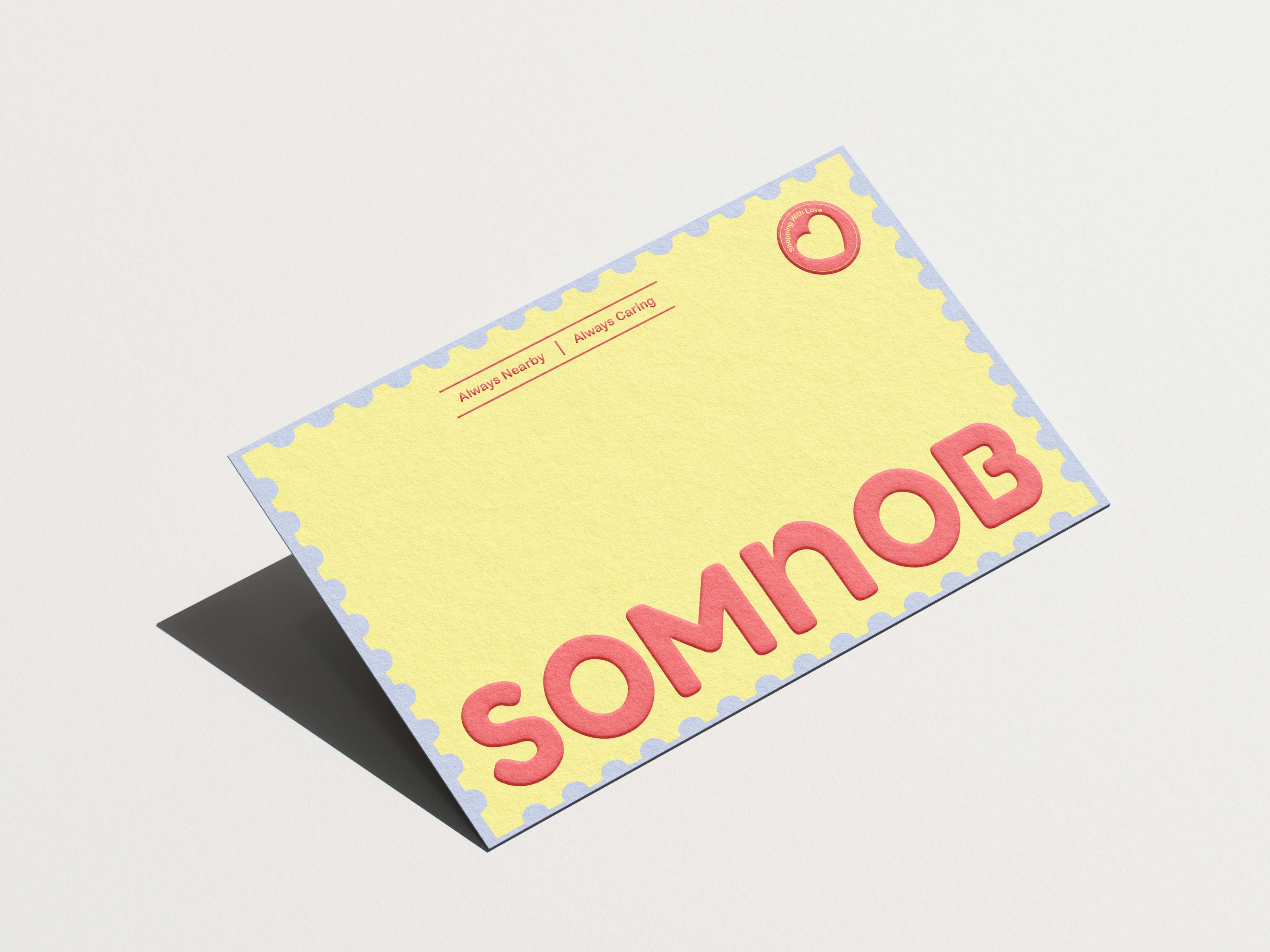
We designed a hand lettered wordmark built to feel painted rather than typed, paired with a tight, consistent palette of cream, mustard yellow, sky blue, and one confident red. That system was carried across every touchpoint business cards, envelopes, stationery, tote bags, and product packaging so the brand felt cohesive whether someone saw it in-store or on a receipt.
Challenge
Somnob was entering a crowded local snack-food market with no visual identity no logo, no packaging, nothing to make it recognizable next to established brands already sitting on shelves. The brand needed a face before it could compete on anything else.
Solution
We designed a hand lettered wordmark built to feel painted rather than typed, paired with a tight, consistent palette of cream, mustard yellow, sky blue, and one confident red. That system was carried across every touchpoint business cards, envelopes, stationery, tote bags, and product packaging so the brand felt cohesive whether someone saw it in-store or on a receipt.
Outcome/Results
Somnob launched with a complete, consistent visual identity across more than a dozen touchpoints instead of a single logo with no system behind it. The brand now has a distinct, memorable look on shelf and online, built from one flexible design system rather than one-off pieces designed separately.
Logo
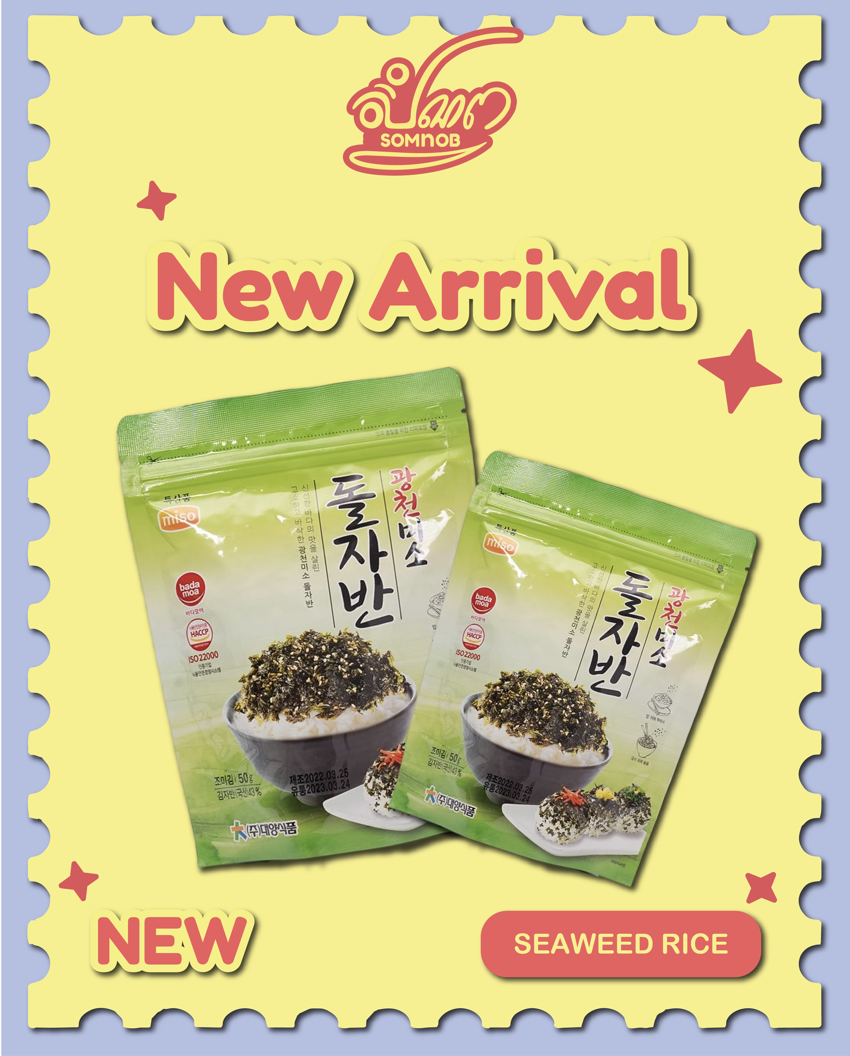
Poster
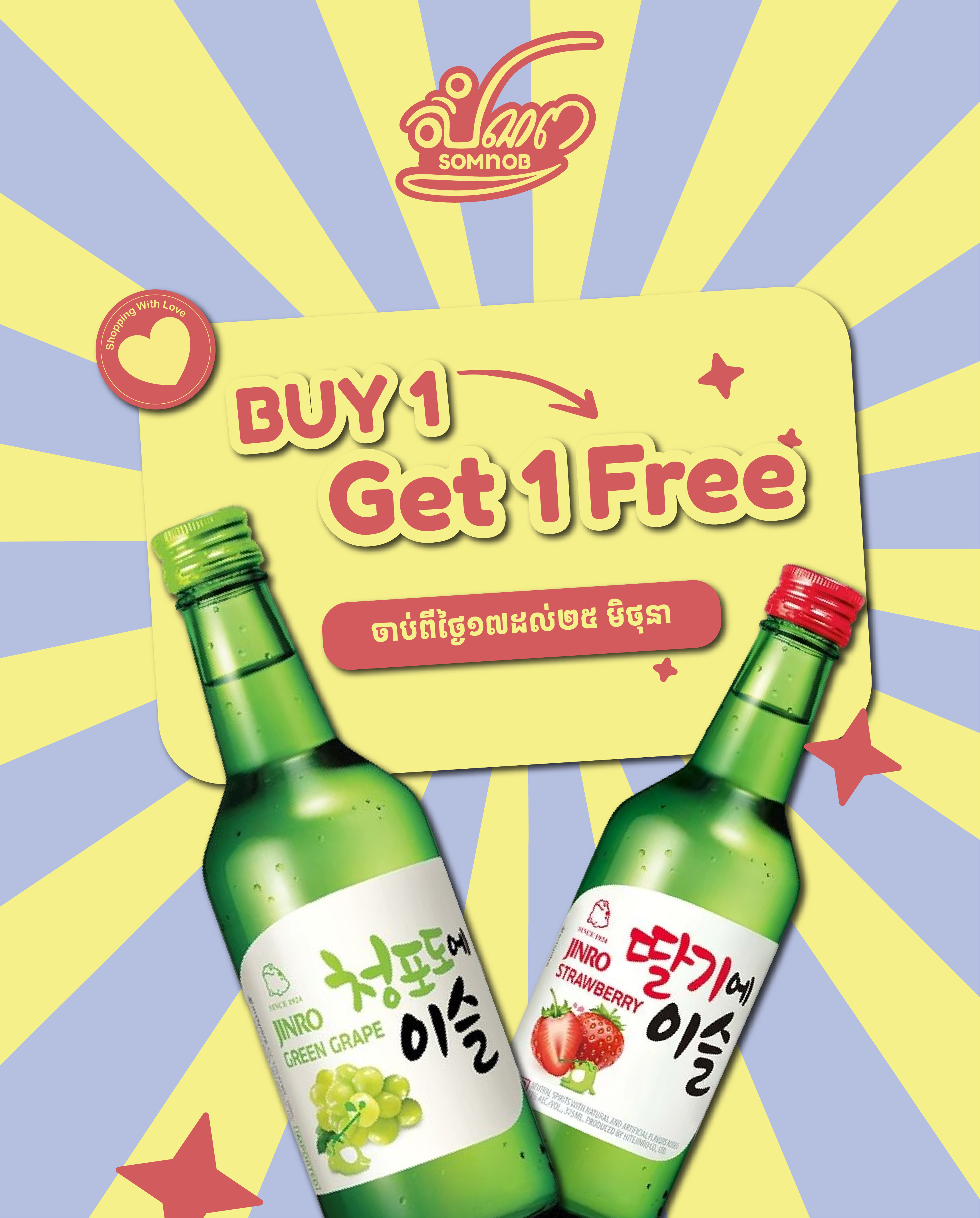
Poster
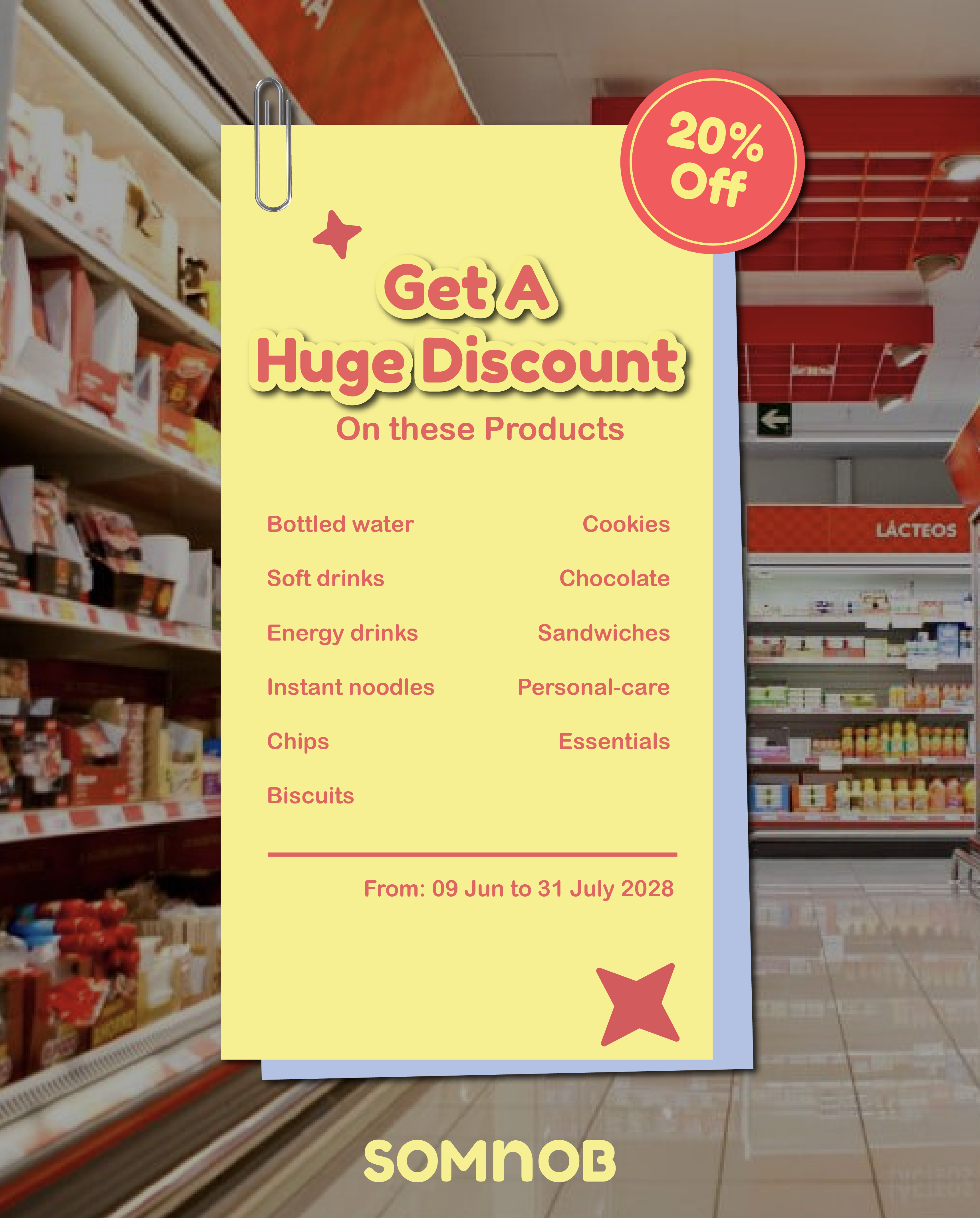
Discount Poster
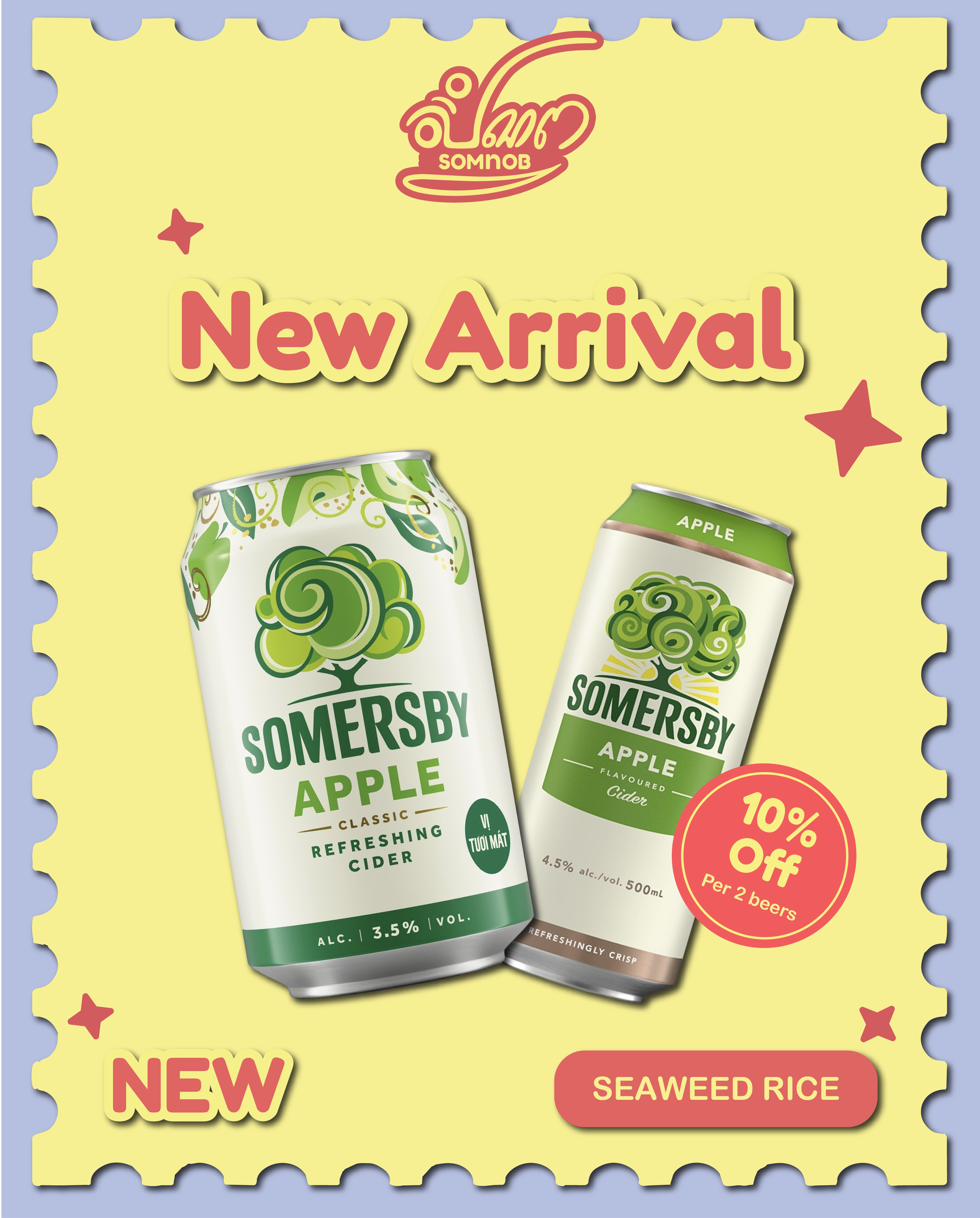
Discount Poster
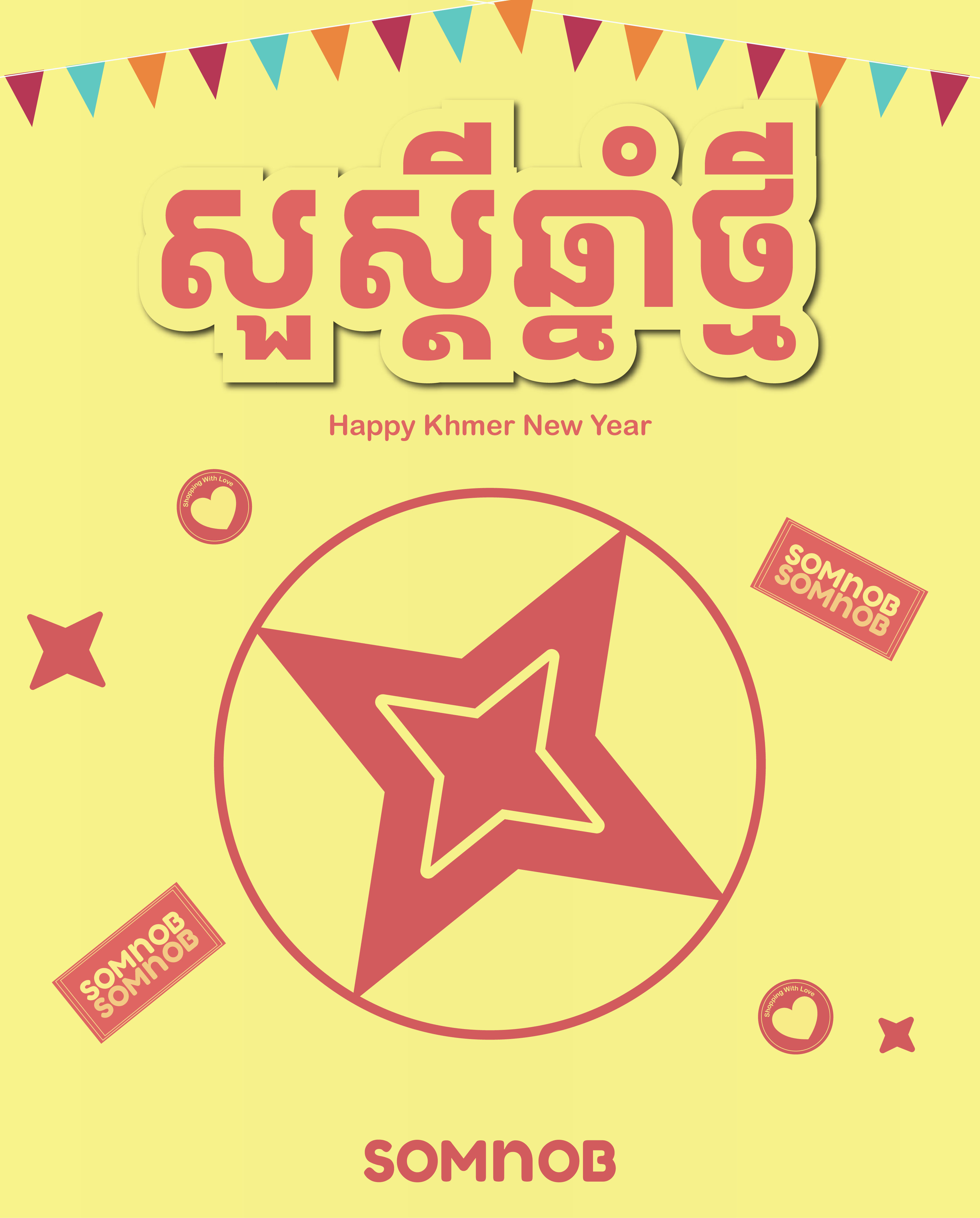
Discount Poster
Poster
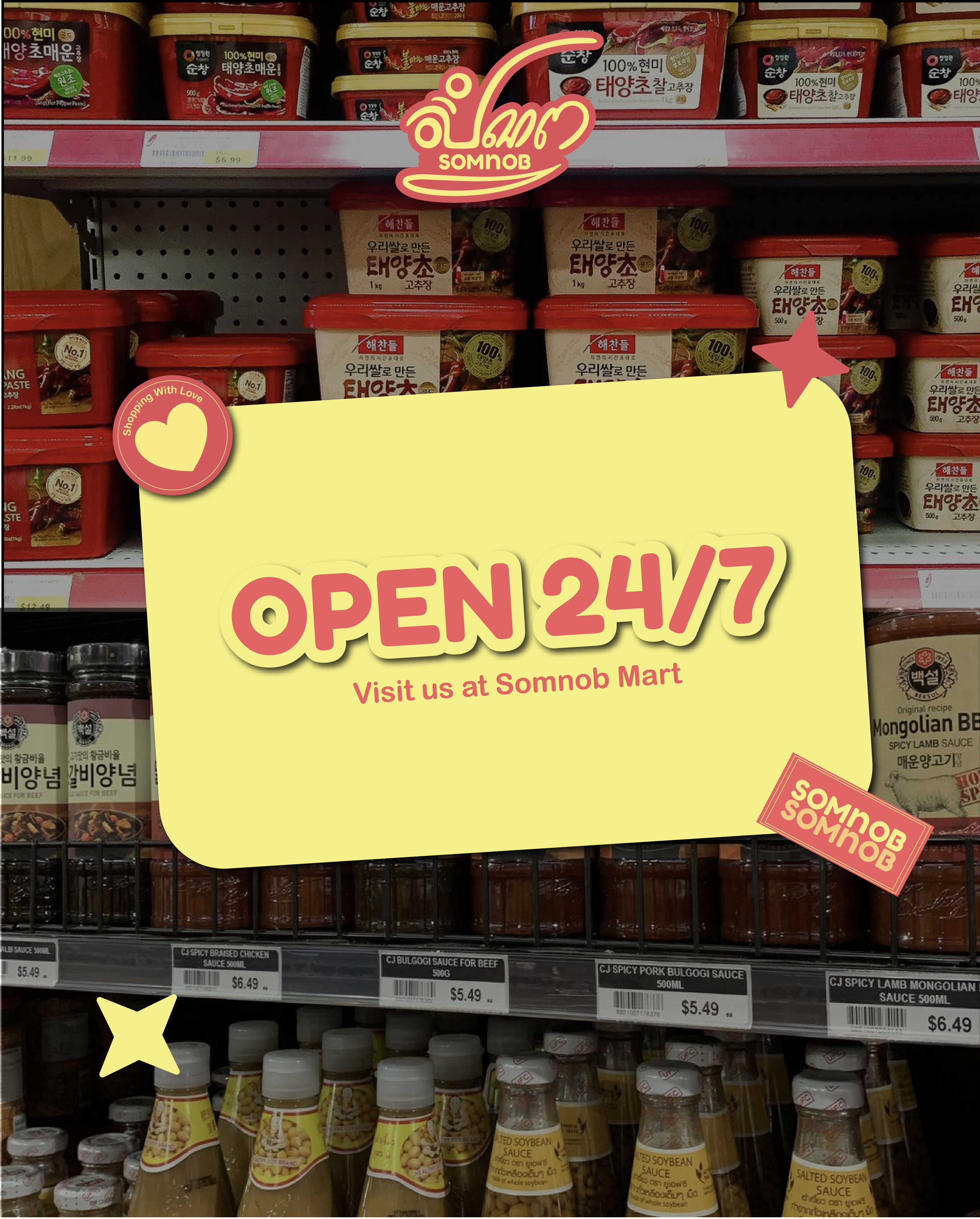
Poster
Logo
Poster
Poster
Discount Poster
Discount Poster
Poster
Poster
@2025 BOOM Business Design Inc. - All rights reserved
