View


Cake Garden
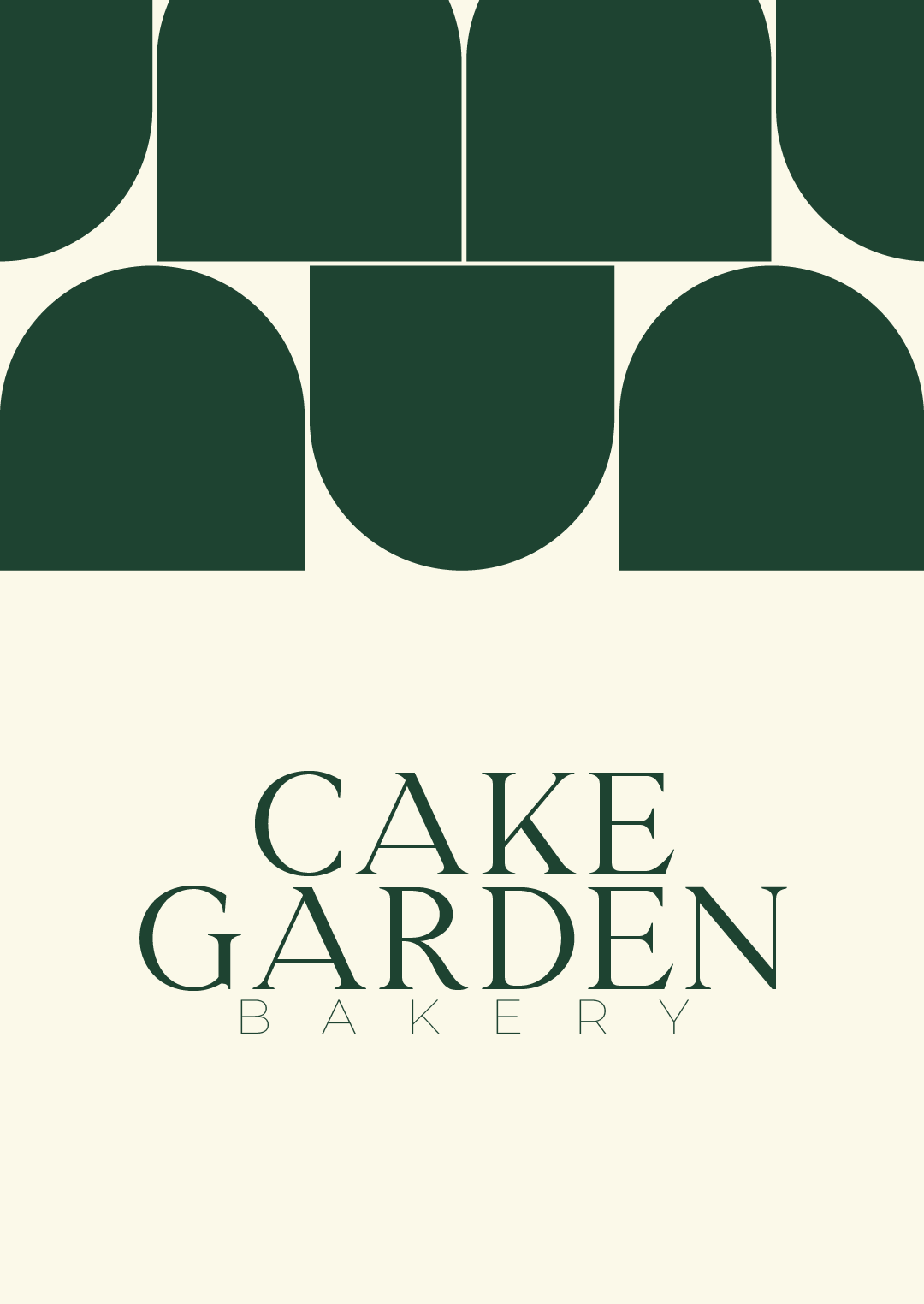
We designed an elegant serif wordmark paired with a light, widely spaced "Bakery" tagline, and built the brand around a deep garden green on warm cream. A system of bold arch shapes, inspired by bakery windows and garden gates, became the signature pattern. It runs across ID cards, boxes, bags, menus and signage, so every touchpoint feels like one brand.
Challenge
Cake Garden was opening a new dessert shop in a market full of bakeries that all looked and felt the same. It had great cakes and pastries but no visual identity, no logo, no packaging and no printed materials. Nothing told customers this was a premium, modern bakery rather than just another cake counter.
Solution
We designed an elegant serif wordmark paired with a light, widely spaced "Bakery" tagline, and built the brand around a deep garden green on warm cream. A system of bold arch shapes, inspired by bakery windows and garden gates, became the signature pattern. It runs across ID cards, boxes, bags, menus and signage, so every touchpoint feels like one brand.
Outcome/Results
Cake Garden launched with a complete, consistent identity across stationery, packaging, staff ID cards and in-store signage instead of a single logo with nothing behind it. The brand now has a calm, premium look that stands out from the bright, busy bakeries around it. Customers recognize the green arch pattern on a box or bag straight away, and the brand is ready to grow into new menus, seasonal campaigns and more locations.
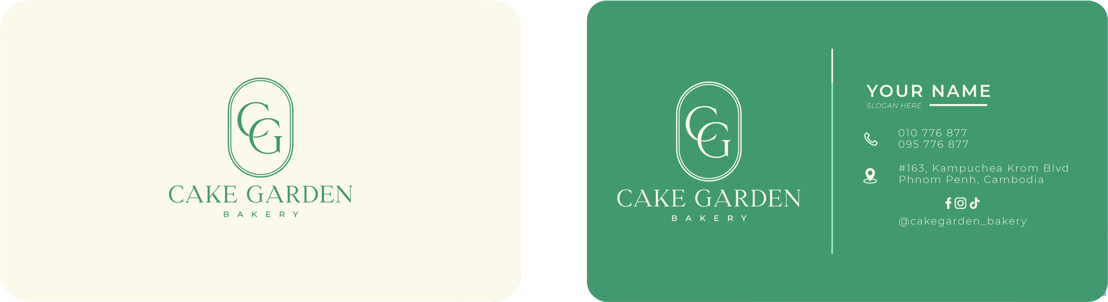
Business Card
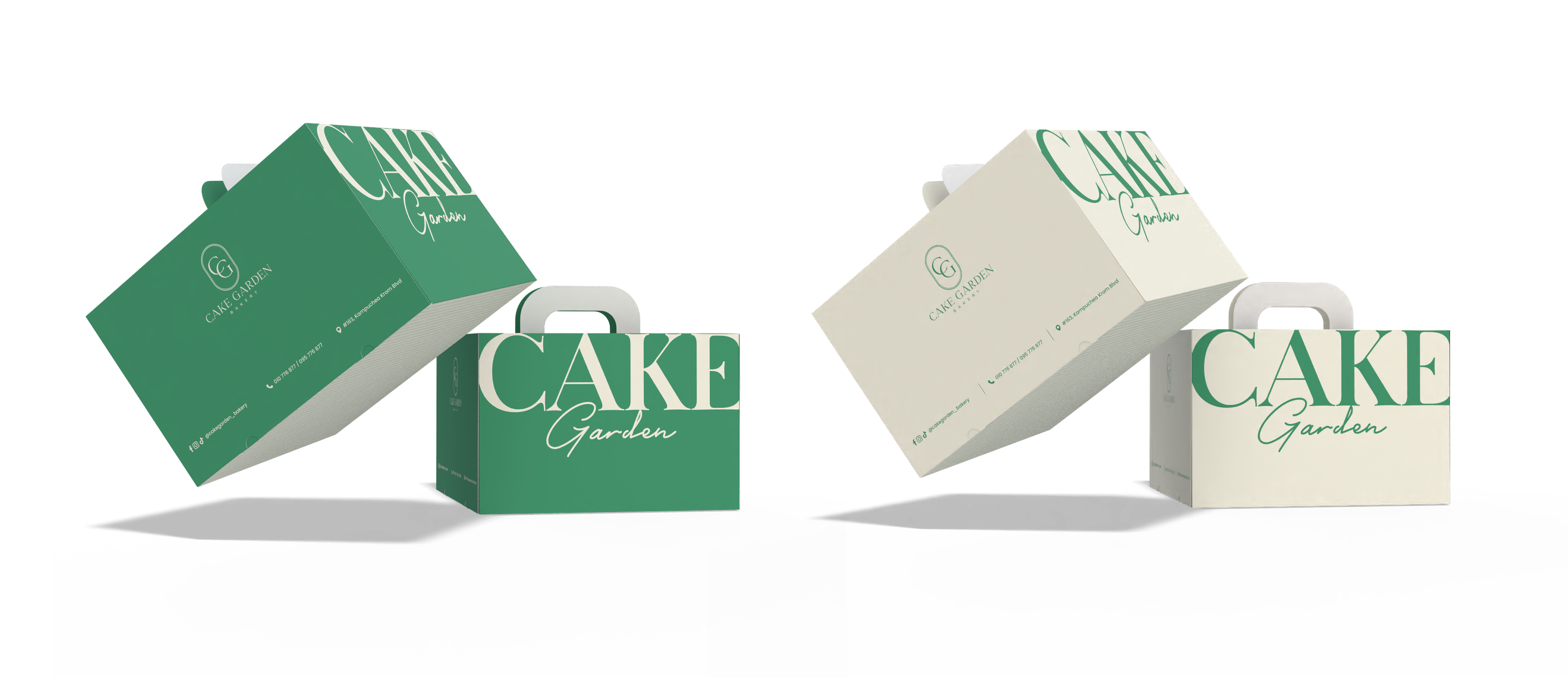
Cake Box
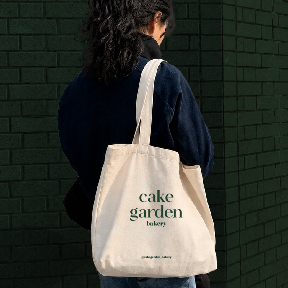
Tote Bag

T-shirt
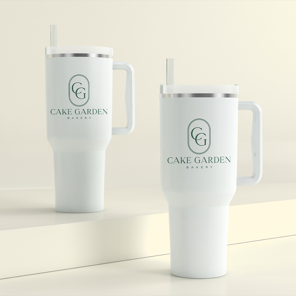
Tumber
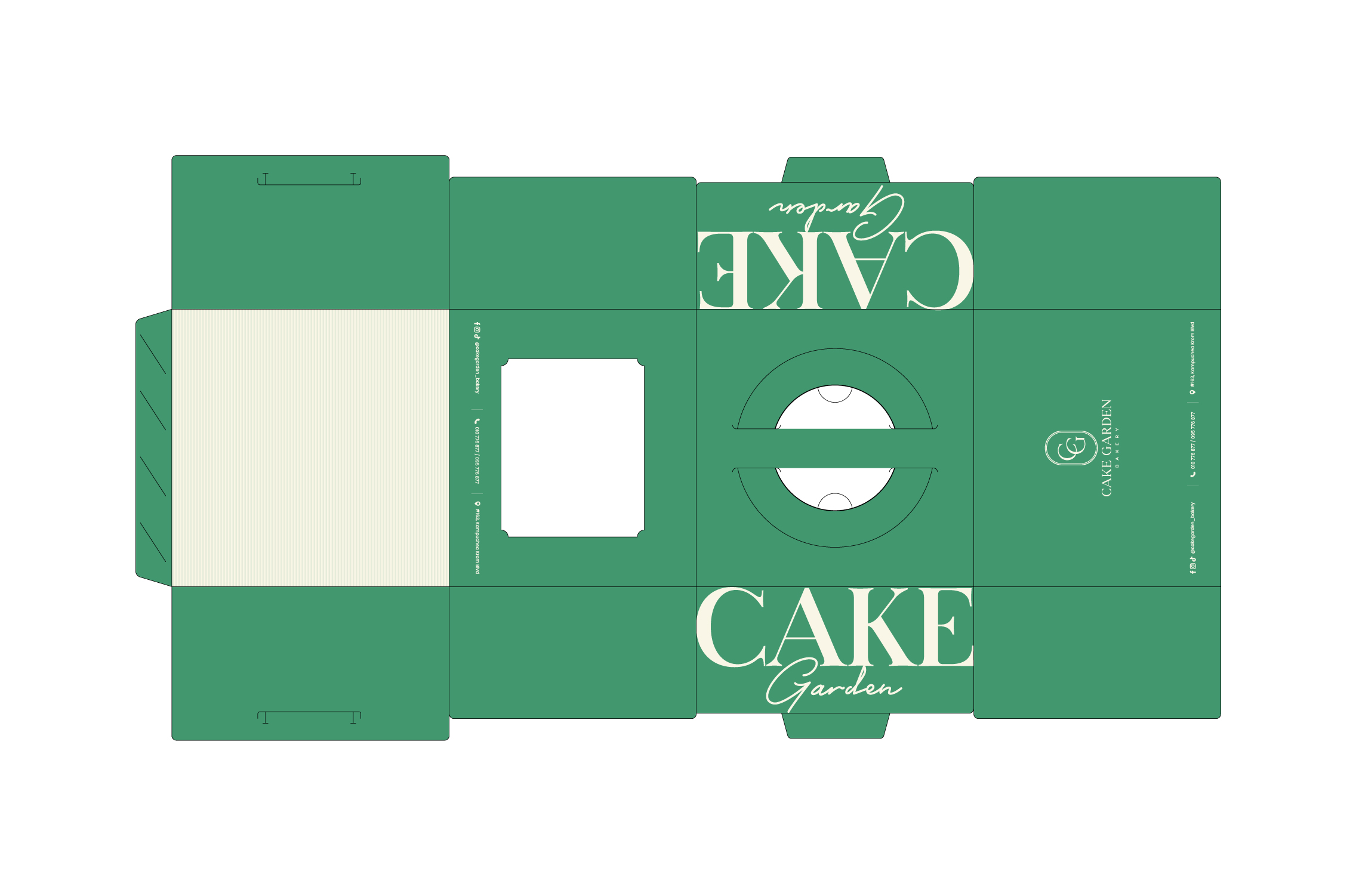
Tumber
Cake Box

Business Card
Cake Box
Tote Bag
T-shirt
Tumber
Cake Box
@2025 BOOM Business Design Inc. - All rights reserved
